Live · Code
claude-code
sonnet
via claude-opus-4.5
Scores, cost & description
judge
layout 8
components 7
content 4
colour 6
gestalt 6
objective
SSIM 76
colour 85
layout IoU 43
OCR text 75
cost
vision—
harness—
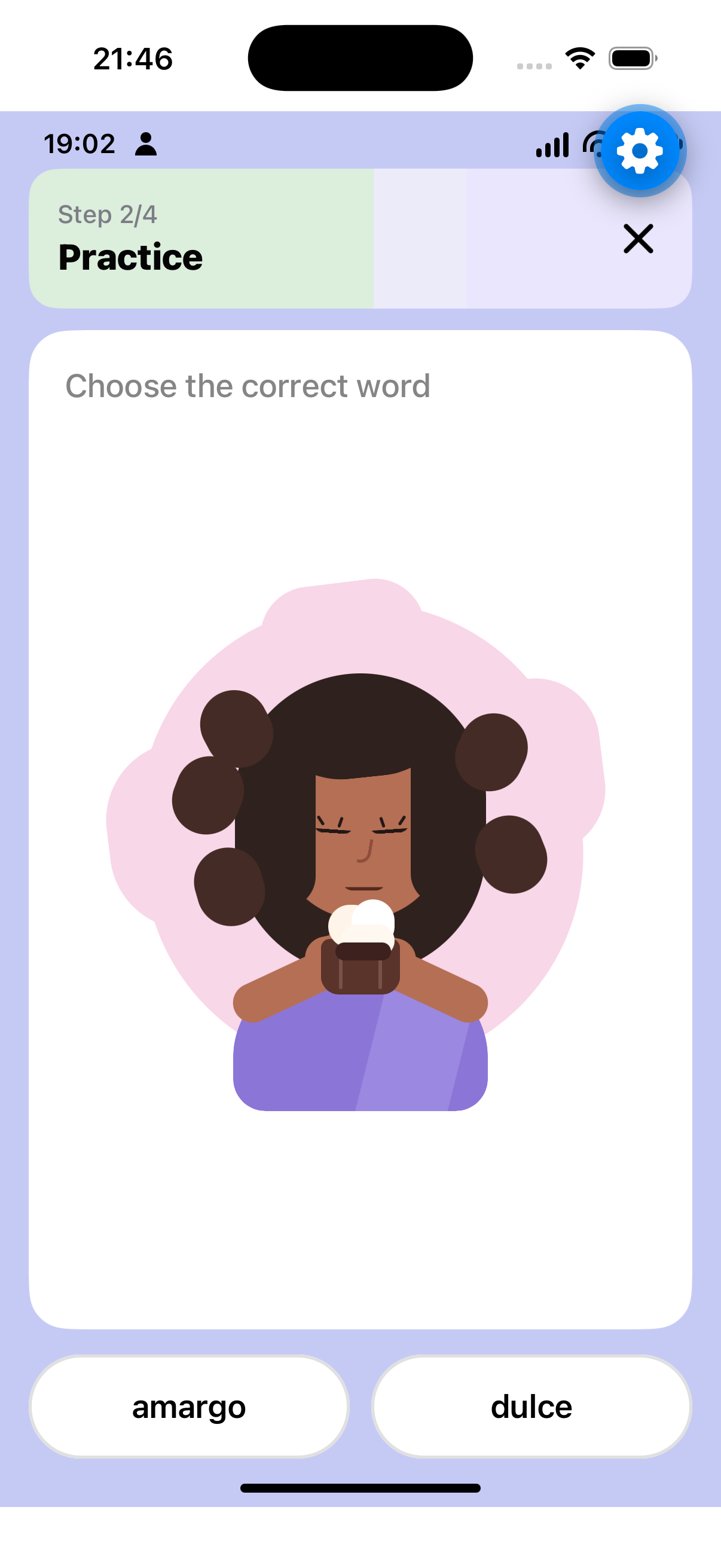
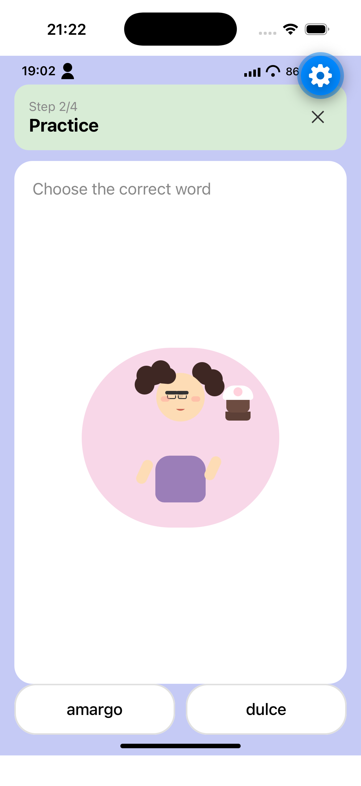
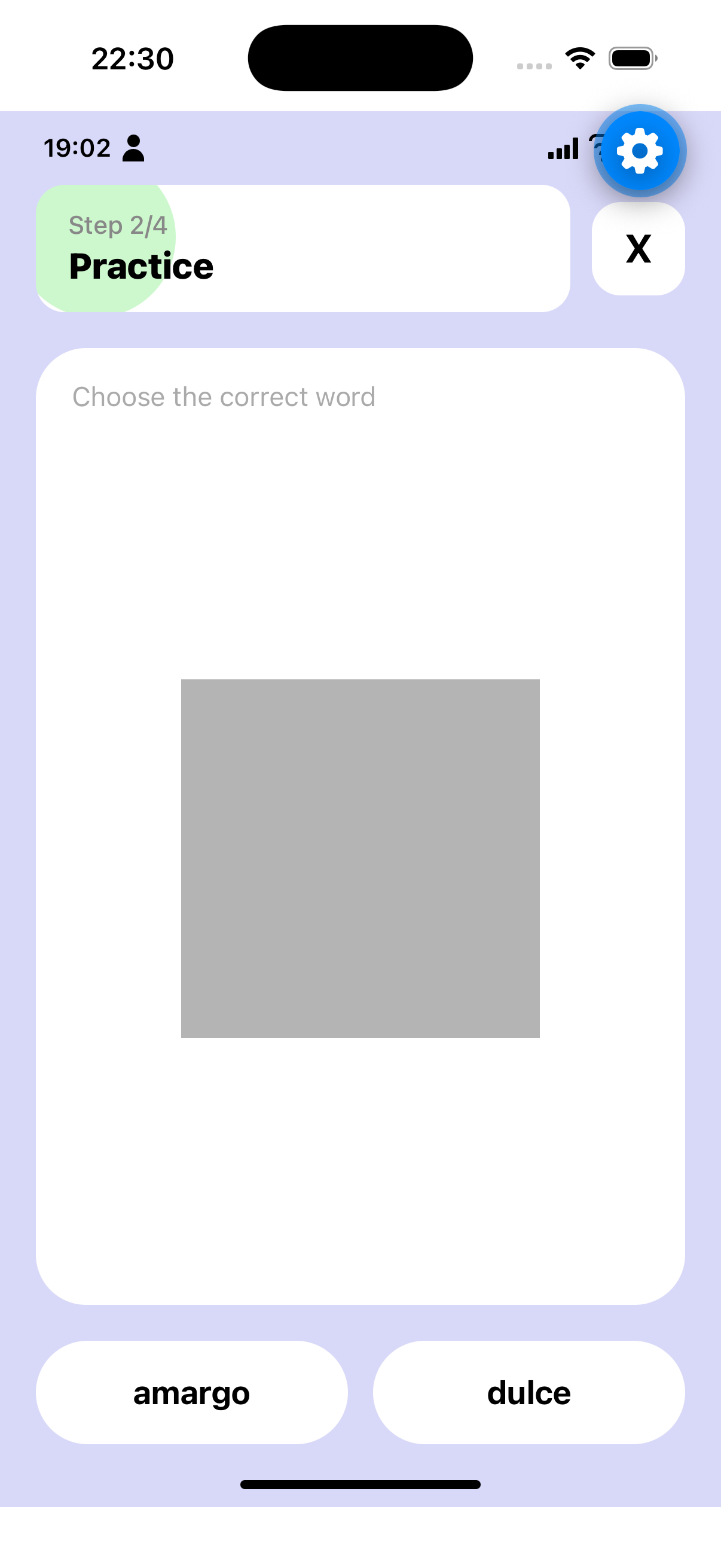
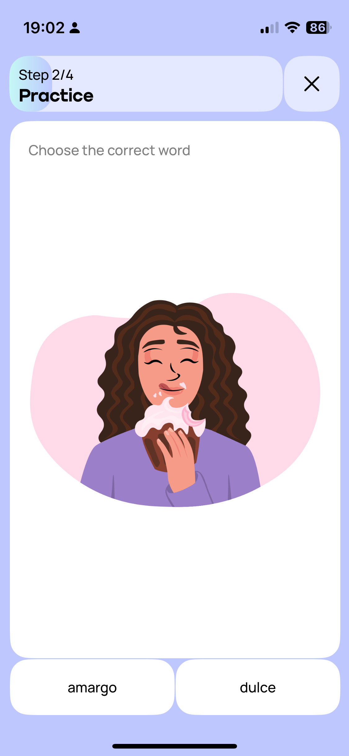
text the harness received
# Screen Description

## Overall Layout and Structure

The screen has a light periwinkle/lavender blue background (approximately #C5CAF5) with a vertical layout consisting of three main sections: a header area at the top, a large white content card in the middle taking up most of the screen, and two answer buttons at the bottom. The system status bar is visible at the very top.

## Components in Reading Order

### Status Bar
At the very top, the system status bar displays the time "19:02" on the left in black text, a person/user icon next to it, and on the right side shows cellular signal strength, WiFi indicator, and battery level showing "86" with a charging indicator.

### Header Section
Below the status bar is a header container with rounded corners (approximately 16px radius), featuring a light mint/sage green tint on the left portion that transitions to a very light lavender on the right. The header spans nearly the full width with horizontal margins of approximately 16px.

Inside the header, on the left side, there are two lines of text: "Step 2/4" in smaller gray text (approximately 14px) on the first line, and "Practice" in bold black text (approximately 20px) directly below it. These are left-aligned with padding of about 16px from the left edge.

On the right side of the header is a close button displaying a black "X" icon, positioned with right padding of approximately 16px. The X icon is medium weight, approximately 24px in size.

### Main Content Card
A large white card with rounded corners (approximately 20px radius) occupies the majority of the screen. It has horizontal margins of approximately 16px from screen edges and vertical spacing of about 12px from the header above.

At the top of the card, left-aligned with padding of approximately 20px, is the instruction text "Choose the correct word" in medium gray color (approximately #888888), font size around 18px.

Below the instruction, centered horizontally within the card, is a large illustration. The illustration shows a woman with long, wavy dark brown curly hair, closed eyes with visible eyelashes, and a content/pleased expression. She is wearing a purple/lavender colored top. She is holding and eating what appears to be a chocolate cupcake or dessert with white cream/frosting on top. The background of the illustration is a soft pink blob shape (approximately #F8D7E8). The illustration takes up roughly 50-60% of the card's height and is centered both horizontally and vertically within the available space.

### Answer Buttons
At the bottom of the screen, below the white card, are two side-by-side buttons with equal width, separated by a gap of approximately 12px. Both buttons have horizontal margins of approximately 16px from screen edges.

The left button has a white background with a light gray border (approximately 1-2px), rounded corners (approximately 24px radius full pill shape), and contains the text "amargo" centered in black, medium weight, approximately 18px font size.

The right button has identical styling: white background, light gray border, rounded corners, containing the text "dulce" centered in black, same font specifications.

Both buttons have vertical padding of approximately 16-20px.

### Home Indicator
At the very bottom center of the screen is a black horizontal home indicator bar, approximately 134px wide and 5px tall, with rounded ends.

## Colors Summary
- Screen background: Light periwinkle blue (#C5CAF5 approximately)
- Header left tint: Light mint/sage green
- Header right: Very light lavender
- Card background: White (#FFFFFF)
- Instruction text: Medium gray (#888888)
- Button background: White
- Button border: Light gray (#E0E0E0)
- Button text: Black
- Step text: Gray
- Practice text: Black
- Illustration background blob: Soft pink (#F8D7E8)

## Spacing and Alignment
- Horizontal screen margins: 16px
- Header internal padding: 16px
- Card internal padding: 20px
- Gap between header and card: 12px
- Gap between buttons: 12px
- Buttons are bottom-aligned with approximately 16px margin from the home indicator area
- All text in header is left-aligned
- Instruction text is left-aligned
- Illustration is center-aligned
- Button text is center-aligned